
Please sign in or register
Existing users sign in here
Having trouble signing in?
Contact Customer Support at
[email protected]
or call+852 3175 1913
"The new identity signifies change, but it positions and displays BT as another generic, unemotive brand."
Contact Customer Support at
[email protected]
or call+852 3175 1913
Top news, insights and analysis every weekday
Sign up for Campaign Bulletins


.jpg&h=268&w=401&q=100&v=20250320&c=1)

Omnicom is set to fully acquire Clemenger Group and launch a new Oceania management structure, with ex-executive Nick Garrett tipped to lead.

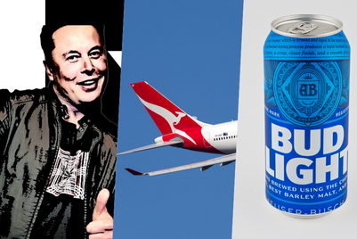
These brands saw jumps in advertising awareness in Australia in May onYouGov's BrandIndex, led by Budget Direct and its 'Balloons' campaign.

OMD APAC kept competitors on their toes with major account wins, standout campaigns, and a clean sweep of top industry awards. But with the incoming complexities of the Omnicom-IPG merger, questions remain about its next phase of growth—and how integration could reshape its market edge.

WPP, Bastion, Edelman, and more, in our weekly collection of people moves and account news.
.jpg&h=334&w=500&q=100&v=20250320&c=1)
.jpg&h=334&w=500&q=100&v=20250320&c=1)
.jpg&h=334&w=500&q=100&v=20250320&c=1)


.png&h=334&w=500&q=100&v=20250320&c=1)

.png&h=334&w=500&q=100&v=20250320&c=1)
